1. HTML standard
A. Missing DOCTYPE
- We know that our web application is not just about HTML, CSS, or JavaScript alone. It’s actually a combination of all of these. So our browser has to process them accordingly.
- Every HTML page must have a <!DOCTYPE html>
B. Missing ALT Attributes
Alt text (alternative text), also known as “alt attributes”, “alt descriptions”, or technically incorrectly as “alt tags”, are used within an HTML code to describe the appearance and function of an image on a page. It is necessary for image tags to have “alt attributes”, as it explains the context of the image.
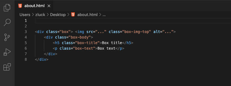
- ALT text is meant to describe what is on your picture, like <img src=”image.jpg” alt=”image description”>.
- Users mostly screen readers use ALTs to understand if the image is important.
C. Avoid using Bold or Italic tags
- The <b> and <i> tags are presentational tags, and have no semantic meaning, instead either change the font-weight/font-style in the CSS or use the <strong> or <em> element.
D. Write HTML Comments
Documented code is better for future changes in code. Comments are also great for debugging HTML, because you can comment out HTML lines of code, one at a time, to search for errors. Every developer should keep this in practice to write comments.
E. Inline Styles
- Inline styles might have a purpose, but they are not the best way to maintain and style your web application. Inline styles don’t separate content from design.
- Inline CSS may be faster than external CSS but still writing an external stylesheet is the best practice.
F. Using Multiple Line Breaks
- Line break tag <br> shouldn’t be used to make gaps between elements, instead split the text into separate paragraphs.
- The main reason for not using <br> is that it’s not semantic. If you want two items in different visual blocks, you probably want them in different logical blocks.
- In most cases this means just using different elements, for example <p> Stuff </p> & <p> Other stuff </p>, and then using CSS to space the blocks out properly.
2. Perfect Grid System
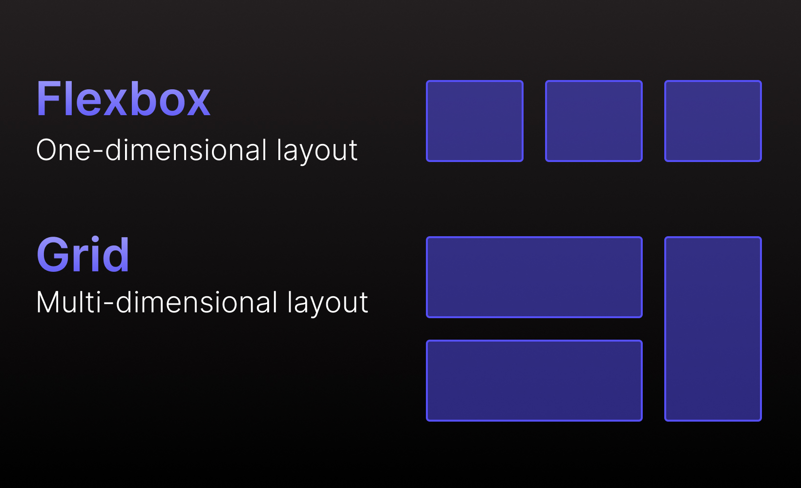
Flexbox:-
- Flexbox is about the positioning of child elements relative to each other within the parent element. Basically: if you need to work in two directions at once (rows and columns) look at the grid. If you need to focus on one direction (a single row or column), this is where you’ll want flexbox.
Grid:-
- Grid is primarily focused on, well, creating a grid with multiple rows and columns that you can populate with elements. You do this by creating a container grid element which you then fill with child elements. There’s a great number of customizations you can make to the grid rows, columns, and cells, which allows you to create grids as simple or complex as you can imagine.
- Flexbox is about the positioning of child elements relative to each other within the parent element. Basically: if you need to work in two directions at once (rows and columns) look at the grid. If you need to focus on one direction (a single row or column), this is where you’ll want flexbox.
3. Mobile Responsive Design
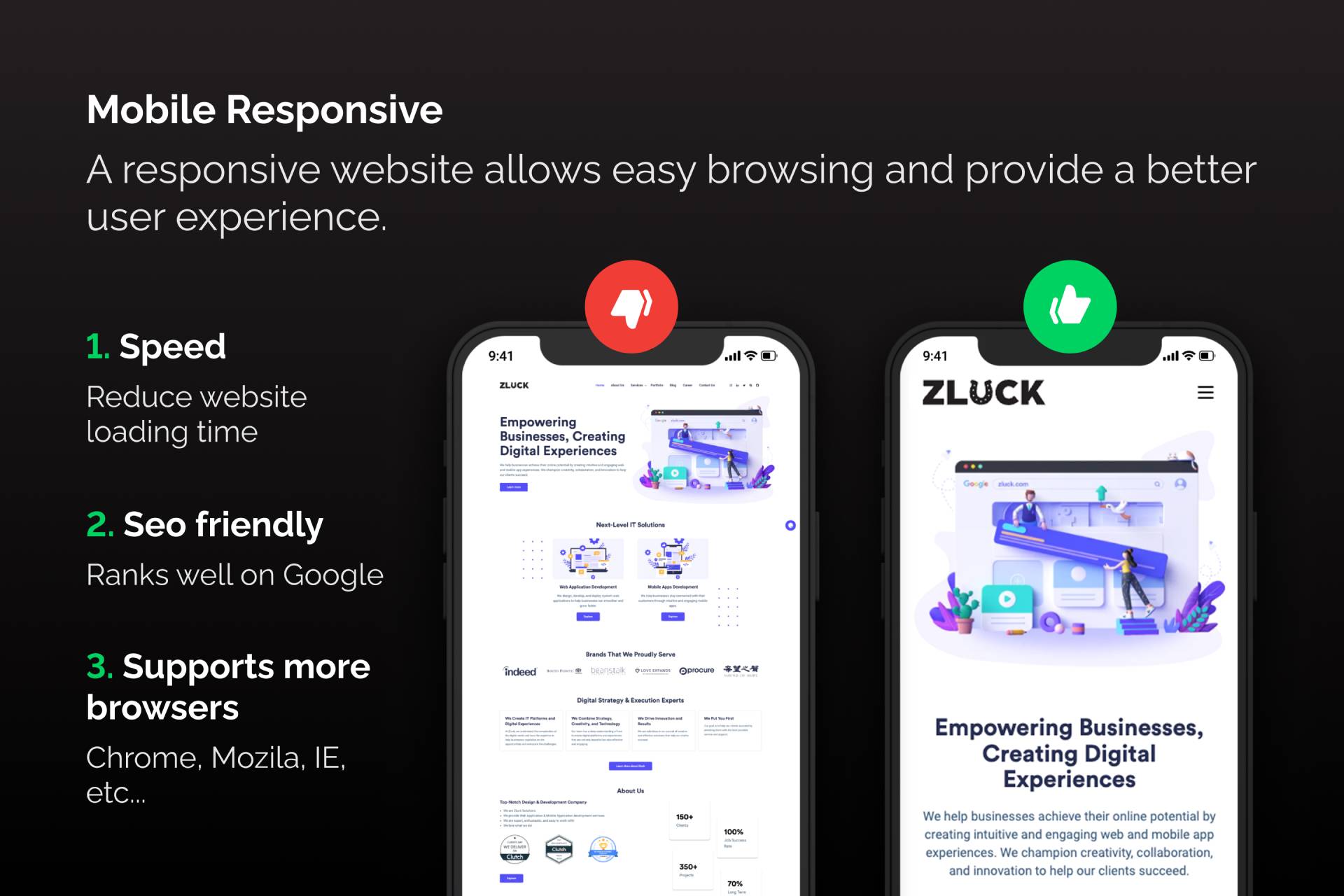
Responsive Web design is the approach that suggests that design and development should respond to the user’s behavior and environment based on screen size, platform, and orientation.
Responsive web design is an approach that ensures all the pages of the website look, work and feel perfectly on any device. Whether it is a tiny old cell phone with a screen width of 320px, a modern phablet with 7 inches screen, a big iPad, or a TV with a massive diagonal line, all the main aspects such as content, design, and especially functionality should perform consistently to provide users with an excellent user experience.
Benefits of Responsive Design
- Improved User Experience
- An Increase in Mobile Traffic
- Faster Website Development
- No Duplicate Content Penalty
- Simpler Website Analytics
- Better Website Loading Times
- Better SEO
4. Check Browser Compatibility
Since different browsers read websites in different ways, it is entirely possible that your website could perform perfectly on Chrome but horribly on Firefox. Ensuring cross-browser compatibility. Why does the website look and perform differently depending on the browser? It mainly has to do with how each browser is built. A website is simply a set of instructions on how your page should look and function; the browser reads those instructions (or codes) and produces what you see on your computer screen. However, each browser may read and interpret those instructions differently, all depending on how that browser was built and its defining features.
5. Common Mistakes to Write CSS
A. Use Color Names Instead of Hexadecimal:-
When you say color: black; you’re essentially telling the computer to display whatever shade of color it thinks blue is. By doing this, you’re giving the browser control over how your web page should be displayed, and as a developer, this is something you should never do.
Using hexadecimal values Eg. color: #000000; hence becomes something that all developers should adopt. It ensures specificity, is supported by all browsers and gives back to you the control to decide exactly how you want your web page to be displayed.
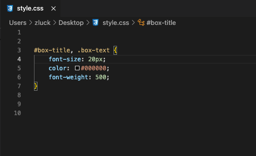
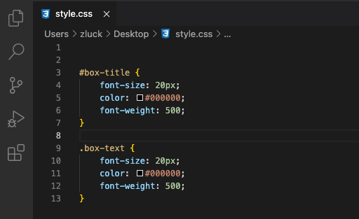
B. Repetitive Code:-
Right way:
Wrong way:
C. Class Name:-
Using a consistent naming convention in your project is a smart idea since if you’re working in a group, consistency is critical. Otherwise, everything will become mixed up. We should also use meaningful names for class and id so that we can debug our code more easily and our code is more understandable.
Summary:
The main takeaway from this resource is that most common programming mistakes in front-end development are easy to avoid. If you fail to include the above-listed precautions in your front-end development practice, you will have to deal with many web development problems.
So having a Zluck Solutions can help your website stand apart from the competition. Avoid the mistakes cited above to develop a memorable front-end experience.
