In today’s highly competitive digital landscape, a strong online presence is essential for small and medium-sized enterprises (SMEs). Your website should not just serve as a digital business card but act as an active tool to engage visitors, build trust, and convert them into leads. This guide will walk you through the key elements needed to create a comprehensive, trustworthy, and lead-generating business website. Let’s dive into what it takes to make your site effective and successful.
1. Choosing the Right Color Scheme for Your Business Website
The color scheme of your website isn’t just about aesthetics-it sets the tone and influences how visitors perceive your brand. Studies have shown that color psychology plays a significant role in how people make decisions, including whether or not they trust a business.
Industry-Specific Colors Start by choosing colors that align with the emotions and values associated with your industry:
- Healthcare websites often use calming greens and whites. For example, the Mayo Clinic’s website uses a clean, white background with touches of blue and green to promote a sense of trust and well-being.
- Technology companies frequently use shades of blue and grey. A great example is IBM, which uses various shades of blue on its website to evoke trust, intelligence, and reliability.
- Creative agencies can benefit from using bold and vibrant colors. For instance, Pentagram, a design studio, showcases bright, attention-grabbing colors that communicate creativity and innovation.
If you’re unsure about which color scheme to use, tools like Coolors can help you generate industry-specific palettes. Simply input your preferences, and Coolors will provide a curated color scheme that aligns with your brand’s identity.
Consistency is Key Maintaining a consistent color scheme throughout your website is crucial for brand recognition. From your homepage to the contact page, make sure your color choices support a unified brand image. A consistent look helps reinforce trust and makes navigation seamless for your visitors.
2. Homepage Essentials
Your homepage is your virtual storefront-it’s often the first impression potential customers have of your business. To create a homepage that engages and converts, include the following elements:

Clear Value Proposition Your value proposition should be the first thing visitors notice. It needs to succinctly explain what your business does and what makes it unique. For example, Canva highlights its value proposition effectively: “Design made easy, and free”. It’s clear, simple, and supported by visuals of its intuitive design platform.
High-Quality Visuals Invest in professional images and videos that align with your brand identity. High-quality visuals not only make your site more attractive but also help communicate complex ideas quickly. If you’re looking for professional stock images, tools like Unsplash and Pexels can be valuable resources.
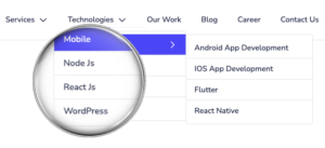
Easy Navigation Menu Your website’s navigation should be intuitive and user-friendly. A cluttered or confusing menu can frustrate visitors, leading them to leave your site. Consider tools like Slickplan for planning and designing your site’s navigation structure.
Strong Call-to-Actions (CTAs) Effective CTAs guide visitors toward taking action, such as “Contact Us,” “Get Started,” or “Request a Quote.” Position CTAs strategically on your homepage-above the fold and at the end of each section-to make it easy for users to engage with your business. See our CTA below.
3. About Us Page
The About Us page is more than just a place to talk about your business-it’s an opportunity to connect with your audience on a personal level. It should tell a story and highlight what makes your business unique.
Company Story Share the journey that led to the founding of your company. For inspiration, look at this About Us page to see how we highlight our mission, journey, and commitment to excellence for one of our clients’ websites.
Mission, Vision & Core Values Clearly define what your company stands for and where it’s headed. Your mission should reflect your core purpose, while your vision should outline your long-term goals. These elements help potential customers understand your dedication and commitment to your field.
Customer Testimonials Including real testimonials from satisfied clients adds credibility and social proof to your About Us page. Testimonials should be detailed enough to provide context but concise enough to be easily scannable. For example, take a look at Zluck Solutions’ client testimonials for an idea of how to showcase customer feedback effectively.
Social Proof Showcase logos of well-known clients or partners, media features, and any certifications or awards. Social proof helps reassure potential customers that they are making a smart choice by choosing your services.
4. Services/Products Page
The services or products page is where you showcase what you offer. It’s not just about listing your services; it’s about convincing visitors that your offerings are exactly what they need.
Detailed Service/Product Descriptions Focus on the benefits your services or products provide. Rather than just listing features, explain how these features will solve your customer’s problems. For example, instead of saying, “Our software has a real-time tracking feature,” say, “Track your projects in real-time to ensure you stay on schedule and meet deadlines efficiently.”
Visuals and Examples Support your descriptions with relevant images, product demos, or videos. Check out this Services page for examples of how visuals can enhance service descriptions.
Transparent Pricing Information Where possible, provide clear pricing information. Being upfront about costs helps build trust and reduces the chances of visitors bouncing off your site because they can’t find the information they need.
FAQ Section Include a section at the bottom of your services/products page that answers common questions. This helps eliminate any doubts or concerns potential customers may have, improving their decision-making process.
5. Testimonials/Case Studies
Customer testimonials and case studies are some of the most persuasive elements you can include on your website. They provide concrete proof that your services deliver results.
Authentic Client Testimonials Feature real testimonials that include specific details about the client’s experience. Statements like “Working with ZLUCK helped us increase our sales by 40% in just three months” are far more powerful than generic comments.
Video Testimonials If possible, include short video testimonials. Videos create a more personal connection and can significantly boost trust and engagement. Tools like Loom can help you capture customer testimonials easily.
In-Depth Case Studies Create case studies that walk potential customers through the problem, your solution, and the results. Be sure to include measurable outcomes, such as, “Our solution helped XYZ Corp reduce operational costs by 30% within the first year.” For inspiration, browse Zluck Solutions’ case studies.
6. Contact Page
A well-designed contact page ensures that potential customers can reach out easily, which can be the difference between securing a lead or losing one.
Simplified Contact Form Keep your contact form as simple as possible by only asking for necessary information, like name, email, and a brief message. Forms that are too long or complex can discourage visitors from reaching out. JotForm is a great tool to help you create simple, secure contact forms.
Multiple Contact Methods Make sure to include all relevant contact methods-phone number, email, and physical address if applicable. Providing multiple ways to get in touch shows that you’re accessible and responsive.
Interactive Map If your business has a physical location, include an interactive map to make it easy for visitors to find you. Google Maps Embed is a quick way to add this functionality to your site.
Business Hours List your business hours so potential clients know when to expect a response. This is particularly useful for service-based businesses that rely on timely interactions.
7. Blog/Resources Section
Having a blog or resources section helps position your business as an industry leader and provides value to your visitors. It’s also an excellent tool for improving your SEO and keeping your site fresh.
Consistent Content Updates Post content regularly to keep your audience engaged and encourage them to return to your site. This also signals to search engines that your site is active and relevant. Need help with content strategy? Use any AI tools to get started like Copy.AI
Educational Guides and Tutorials Create how-to guides and tutorials that offer real value to your audience. For example, a digital marketing agency could publish a guide on “How to Optimize Your Website for Better SEO.” Detailed, step-by-step content showcases your expertise and builds trust.
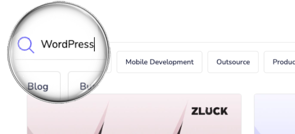
Search Functionality Implement a search bar in your blog or resources section so visitors can easily find content relevant to their needs. This improves user experience and encourages visitors to explore more of your site.
8. SEO Basics
SEO is essential for ensuring that your website ranks high in search results, making it easier for potential customers to find you.
Crawlability and Indexability Ensure that all essential pages are easily crawlable by search engines. This means having an XML sitemap and a well-configured robots.txt file to guide search engine crawlers. Tools like Yoast SEO for WordPress can help manage these elements.
On-Page SEO Optimize every page’s title tags and meta descriptions with relevant keywords. Use heading tags (H1, H2, H3) strategically, and make sure your images include alt text. On-page SEO also involves using internal linking to help search engines understand the structure of your site. You can use a tool like SEOBility for checking SEO score
Analytics Setup Integrate tools like Google Analytics and Google Search Console to monitor your traffic, user behavior, and page performance. Understanding how visitors interact with your site will help you make data-driven decisions for future improvements.
9. Security Features
A secure website not only protects your business but also builds trust with your visitors. Security should be a top priority, regardless of the industry.
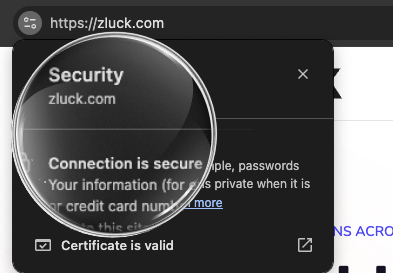
SSL Certificate Ensure your website is HTTPS-secured. An SSL certificate encrypts data and protects user information, which is crucial for building trust, especially if your website processes payments or collects personal data. Learn more about obtaining an SSL certificate from Let’s Encrypt.
Cookies Permission
To comply with global privacy laws like GDPR and CCPA, include a cookie consent banner that informs users about the use of cookies and allows them to manage their preferences. Tools like CookieYes can help you implement this seamlessly.
Privacy Policy Page Transparency is key when handling user data. A well-written privacy policy tells visitors how their data is collected, stored, and used. This is not only good practice but also required by law in many regions.
Trust Badges Display trust badges that indicate security measures, such as “Verified by [Security Software]” or “100% Secure Checkout,” if applicable. These signals reassure visitors that their data is safe.
10. Mobile Optimization
Mobile optimization is no longer optional. With more than half of all web traffic coming from mobile devices, your site must perform well on smaller screens.
Responsive Design Ensure that your website automatically adjusts to fit any screen size, from desktops to smartphones. This not only improves the user experience but also boosts your search engine ranking. Use this Mobile-Friendly Test tool to check if your website is optimized for mobile.
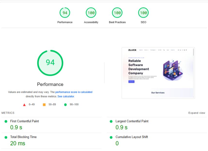
Optimize for Speed Slow-loading sites drive visitors away. Use Google PageSpeed Insights to check your site’s performance and make necessary optimizations. Compress images, minimize CSS and JavaScript, and use a reliable hosting provider.
Mobile-Friendly Navigation Design your site’s navigation to be user-friendly on mobile devices. This means using larger buttons, simple dropdown menus, and ensuring that all clickable elements are easy to tap.
11. Nice-to-Have Features
Adding extra features can set your website apart and enhance the user experience:
Accessibility Features Ensure that your website is accessible to users with disabilities. This can include adding keyboard navigation, alt text for images, and screen reader compatibility. WAVE Web Accessibility Tool can help assess your website’s accessibility.
CRM Integration Integrate your website with CRM software to manage and capture leads effectively. Tools like HubSpot and Salesforce can automate your lead management process, helping you stay organized and responsive.
Live Chat Options Consider adding a live chat widget to provide real-time customer support. This can be particularly helpful for answering questions quickly and boosting user engagement. LiveChat is a popular option for adding this feature to your site.
12. Ongoing Monitoring and Maintenance
A business website isn’t something you set up once and leave alone. Regular updates and maintenance are necessary for keeping it functional and secure.
Regular Updates Keep plugins, themes, and your website’s back-end technology updated. Outdated software can create security vulnerabilities and affect performance. Zluck Solutions’ website maintenance services can help you keep your site in top shape.
Content Refreshes Review and update your website’s content periodically to ensure it remains relevant. This could mean adding new information, updating old data, or refreshing the design of certain elements.
Performance Monitoring Use tools to track your website’s speed and uptime. Regularly monitor these metrics to catch potential issues early and make improvements as needed. UptimeRobot is a useful tool for tracking uptime.
User Behavior Analysis Analyze visitor data through tools like Google Analytics to understand what’s working and what isn’t. This insight will help you make data-driven decisions for future updates.
Security Upgrades Regularly review your security protocols and make upgrades to protect against new threats. Keeping security practices up-to-date will help maintain trust with your customers.
Conclusion
A business website is more than just an online presence-it’s a vital platform that helps you build trust, showcase your expertise, and convert visitors into customers. By following this comprehensive checklist, SME business owners can create a website that meets modern digital standards, engages visitors, and drives long-term business success. If you’re looking for help in building or enhancing your website, Zluck Solutions is here to guide you.
FAQs
- What makes a good business website? A good business website is user-friendly, informative, optimized for search engines, and includes trust-building elements like client testimonials and a clear value proposition.
- Why is SEO important for a business website? SEO ensures that your website ranks higher in search results, making it easier for potential customers to find you.
- How should I choose the color scheme for my business website? Choose a color scheme that aligns with your industry. For instance, healthcare websites often use calming greens and whites, while tech companies benefit from professional blues and greys.
- What should I do to maintain my website? Regularly update your website’s plugins and software, monitor performance, and refresh content to keep it secure and relevant.
- How can I integrate lead management tools into my website? Connect with CRM software like HubSpot or Salesforce to manage and capture leads directly from contact or sign-up forms.

